Page 1 of 2
Kung-Fu Hustle: UK BD vs R1US DVD vs R0HK DVD
Posted: 11 Jun 2008, 12:32
by tom2681
Posted: 11 Jun 2008, 15:00
by bradavon
Thanks Tom. It looks like a good upgrade.
Posted: 11 Jun 2008, 17:52
by romerojpg
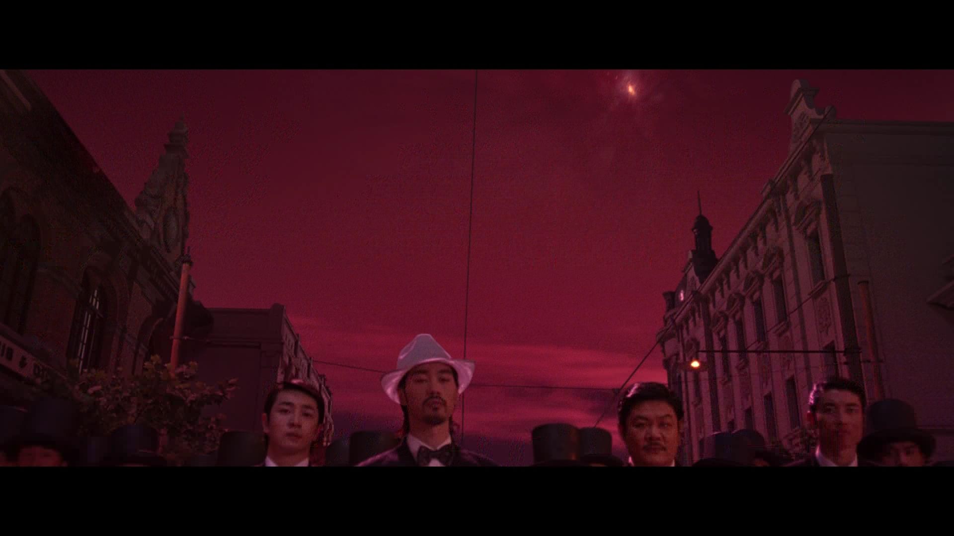
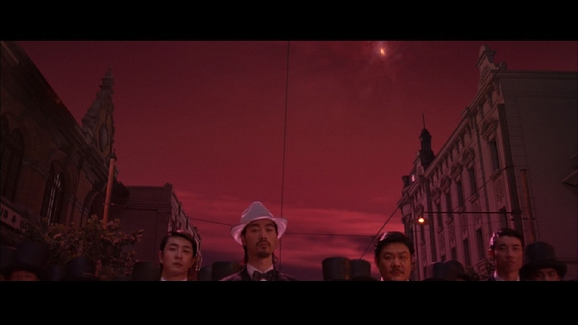
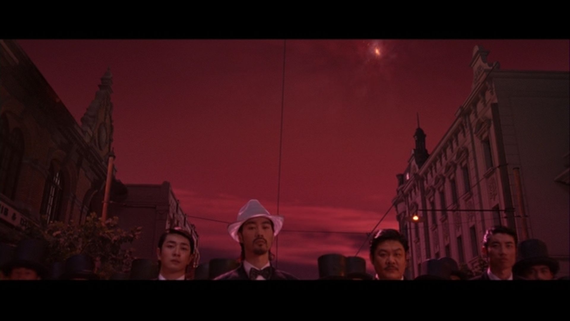
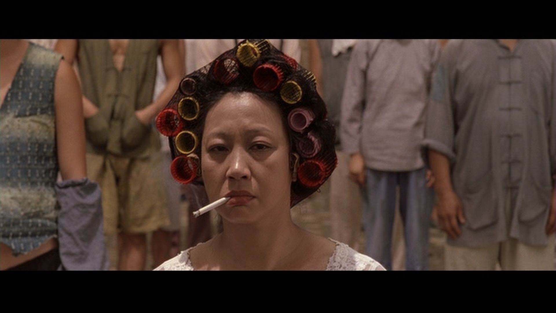
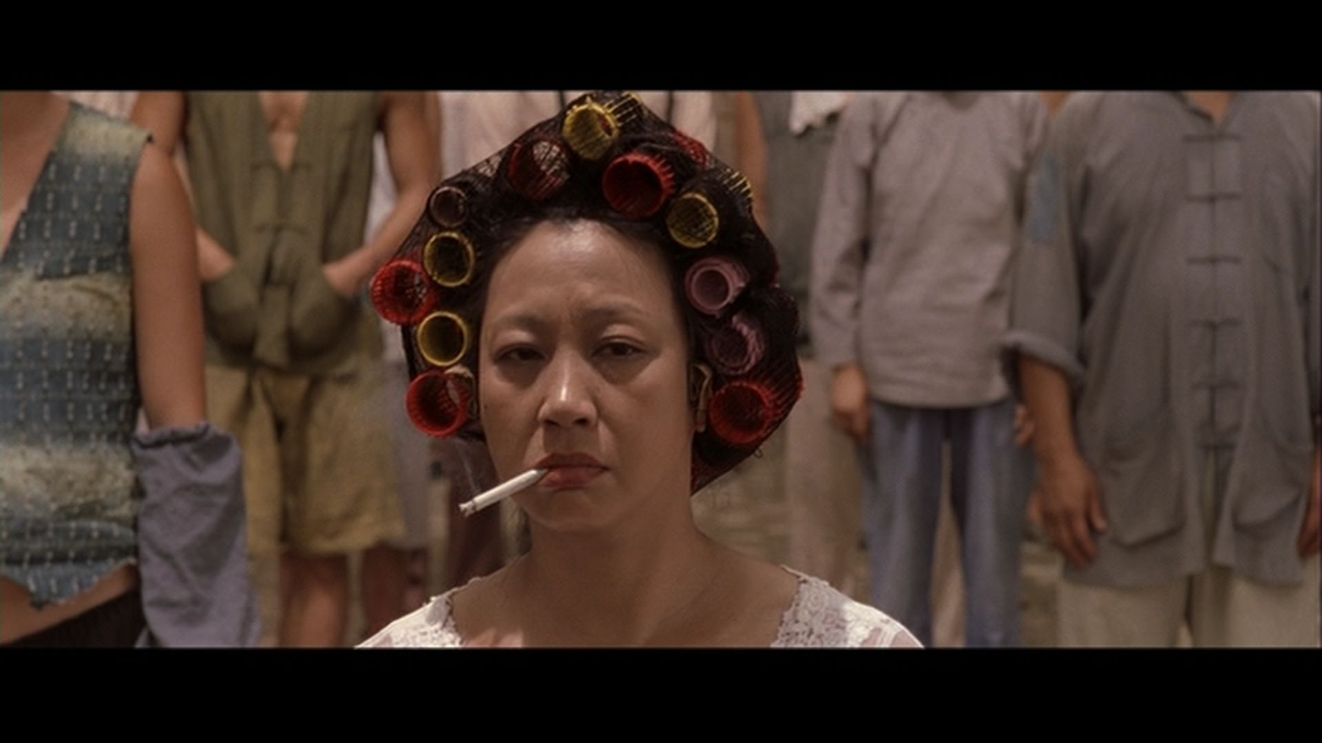
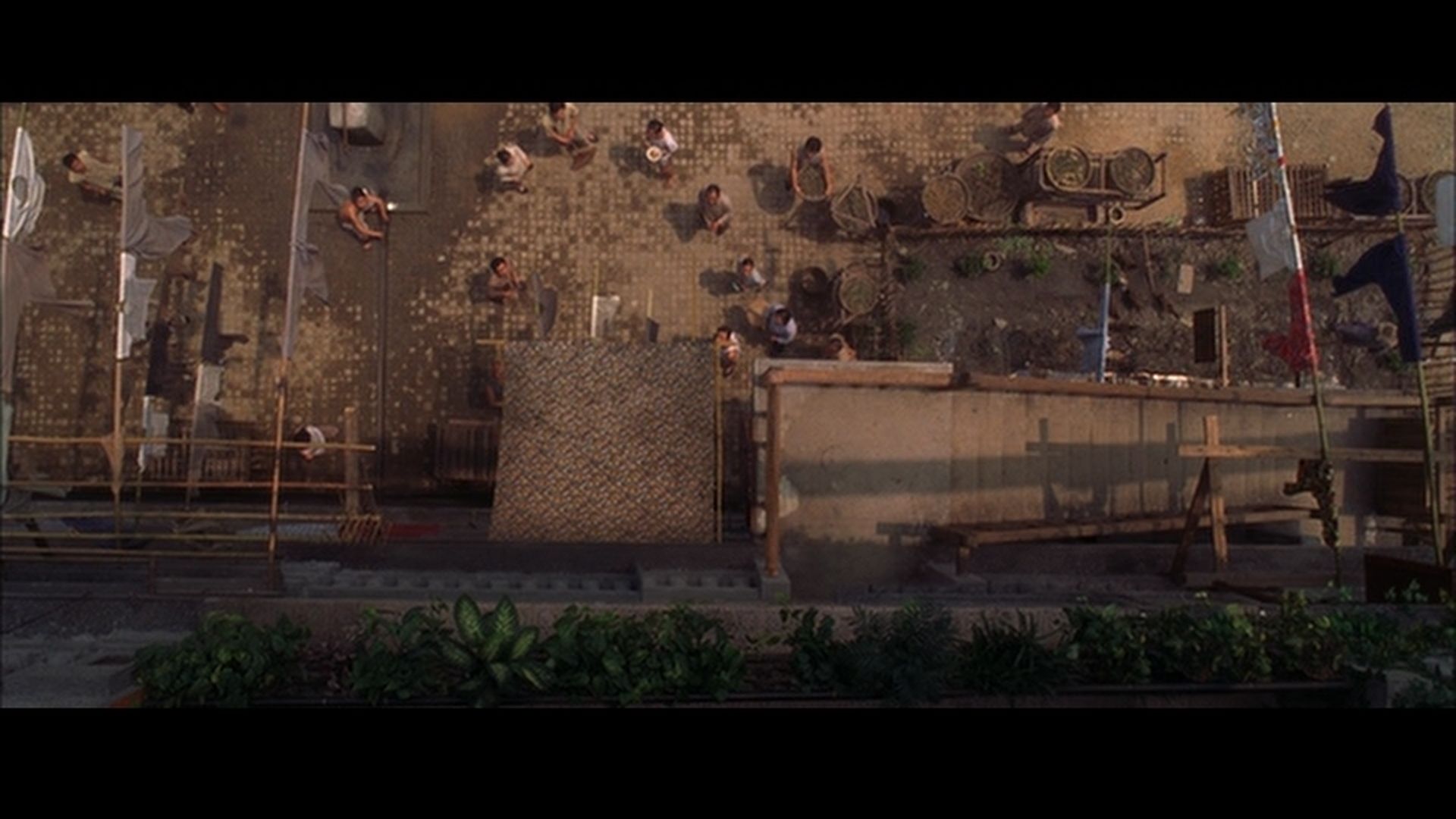
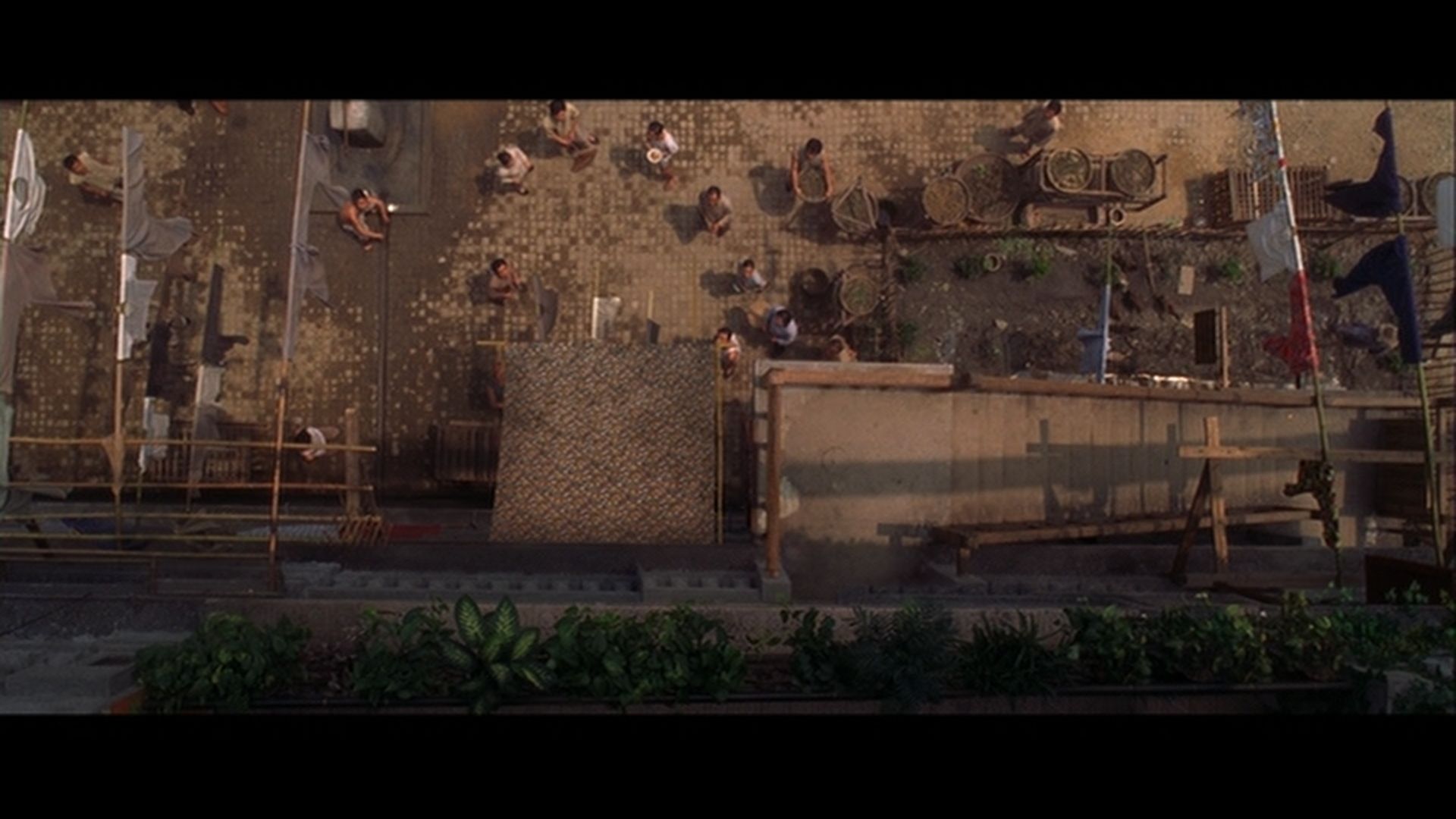
God the blu ray looks like shit in some of them shots! the second image is compression hell! its like lego, dire compression problems.
Posted: 11 Jun 2008, 18:13
by bradavon
You do like to exaggerate don't you Romero

. Compression
hell, talk about being OTT.
I see the USA DVD is cropped at the bottom, in at least one shot.
Posted: 11 Jun 2008, 18:28
by romerojpg
So are you blind and dont see the shocking blocking? its shit in 2 of the shots. Thats not HD, its shit HD.
Posted: 11 Jun 2008, 18:58
by bradavon
According to you, everyone except you is blind
.
Posted: 11 Jun 2008, 19:00
by gasteropod
I own the UK Blu-ray, and whilst not having a mindblowing transfer, I've certainly never noticed 'shocking blocking'

Posted: 11 Jun 2008, 19:07
by romerojpg
Nothing wrong with my eyes B.
The thing with bocking like that is some people notice it and some never do, I do a lot and it pisses me off! I also notice jaggies, noise reduction and edge enhancement all the time as well, again many dont.
https://www.bulletsnbabesdvd.com/forums/ ... FHBLU1.jpg
That image alone is ugly as hell, but hell it may look fine in motion I guess, could just be a blip of a frame or two. But still they have the space on a Blu Ray to stop this shitty compression, its not as if they fill discs.
Posted: 11 Jun 2008, 19:34
by bradavon
romerojpg wrote:Nothing wrong with my eyes B.
I didn't say there was anything wrong with your eyes

romerojpg wrote:That image alone is ugly as hell
As I was saying that's just a slight exaggeration. Sure it's not amazing but Ugly as Hell?
The first Fifth Element release was ugly as hell, this isn't. Every thing's either a masterpiece of ugly as a fuck in your book, learn some words in between
.
Posted: 11 Jun 2008, 19:34
by grim_tales
Romero's blu cap looks worse than Toms
Posted: 11 Jun 2008, 19:35
by bradavon
How is that possible Grim? It's the same ruddy link. Look at the link in Romero's post. I seriously doubt Romero has access to "Tom's" image area
.
Posted: 11 Jun 2008, 19:46
by romerojpg
Fifth Element looks far better than that cap I posted thats for sure.
Posted: 11 Jun 2008, 20:25
by bradavon
Not IMO. The first release looked god awful.
Posted: 11 Jun 2008, 20:27
by tom2681
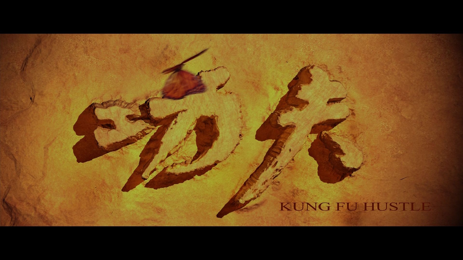
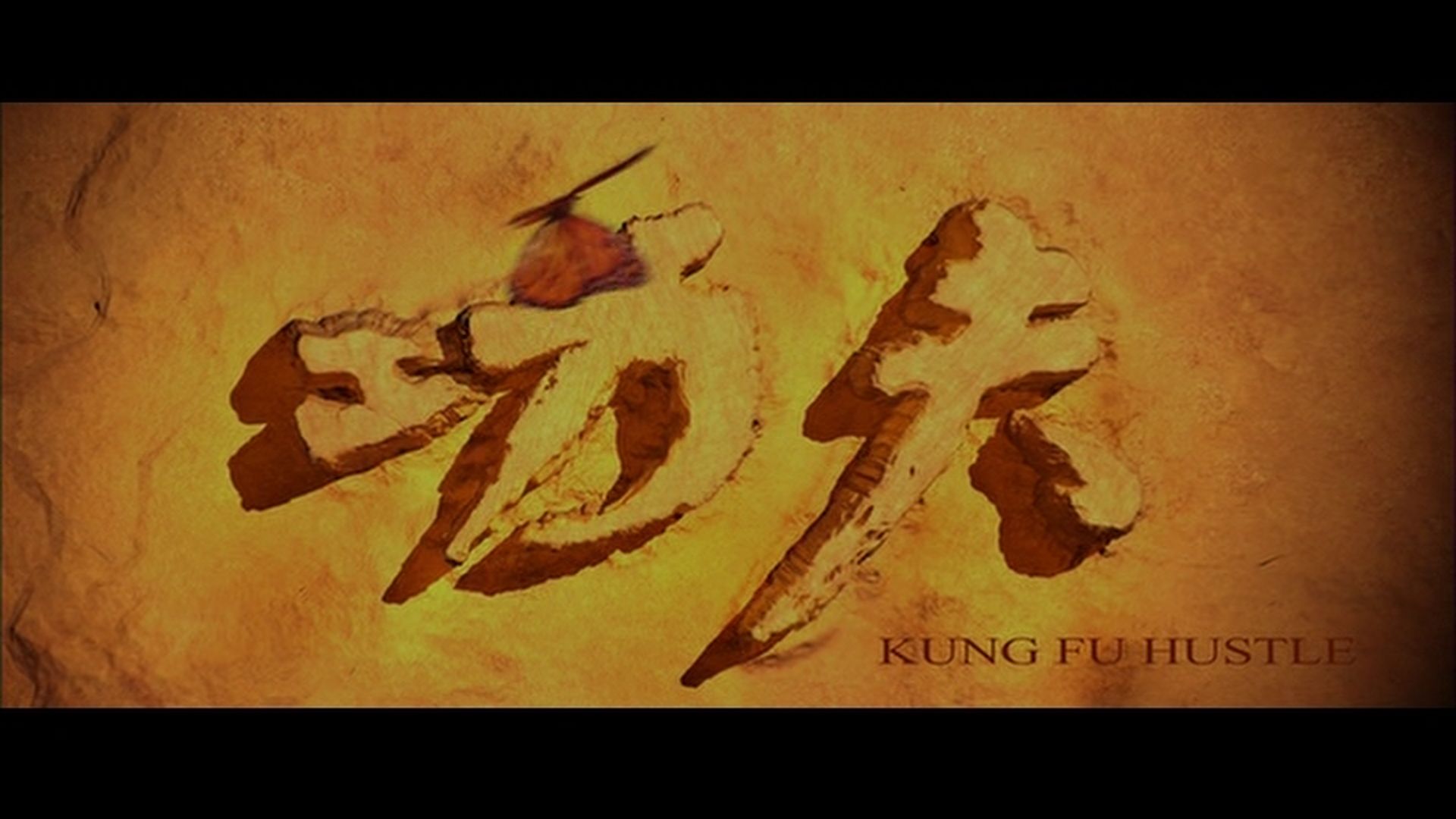
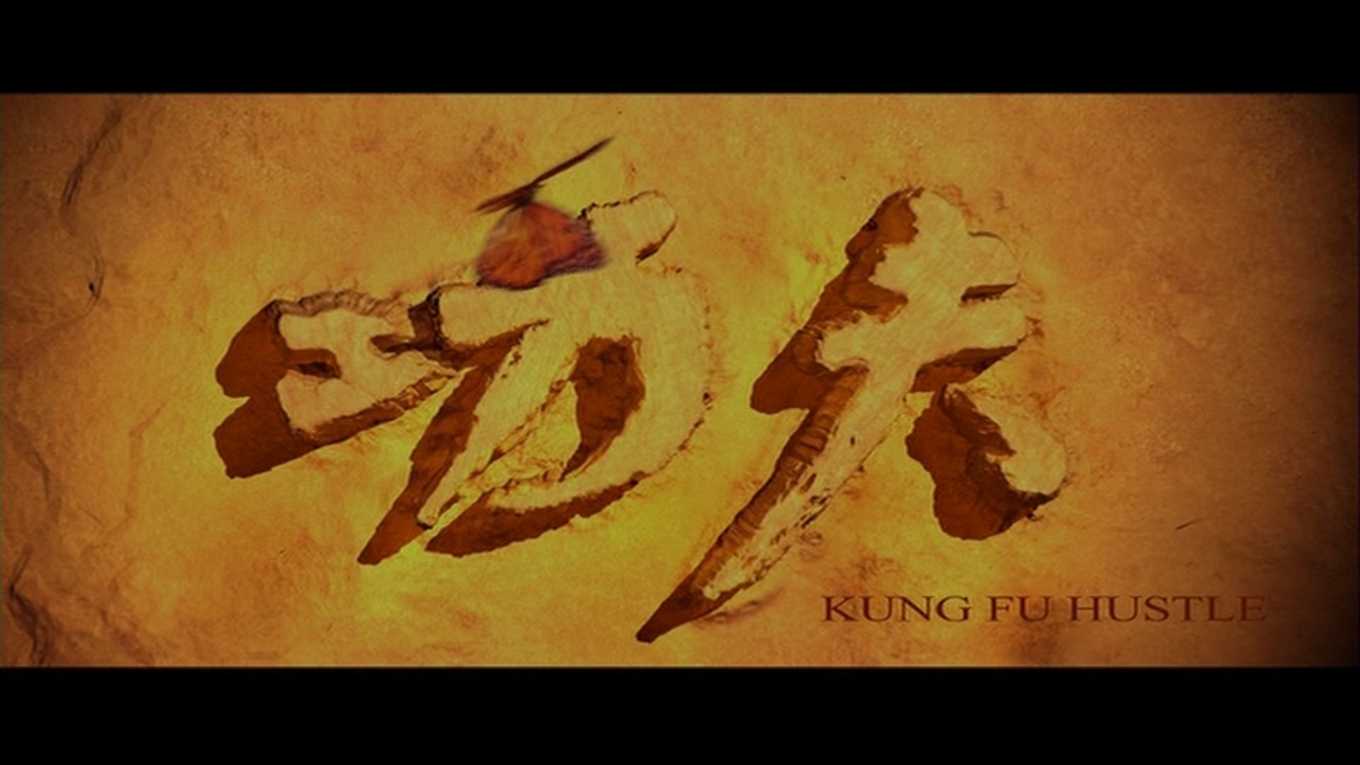
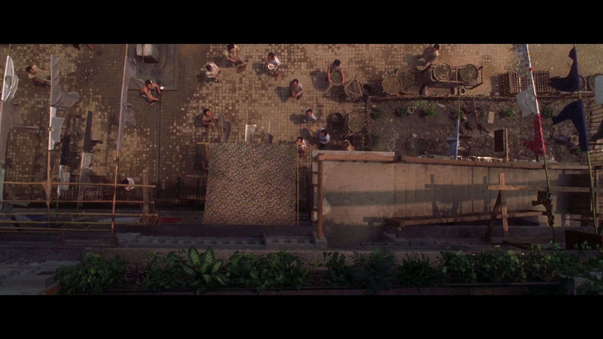
It's true that dark shots show a lot of compression artefacts in KFH.
But depending on how your displays are set-up, you might not even notice the macroblocking.
Also note that the Jpeg compression adds a few artefacts too.
Gotta agree with Romero: the screencap looks fucking awful.
Hopefully the issue will be less noticeable in motion.
Note that on cap n°1, the DVD has less blocking than the BD.
But still, the added sharpness makes up for it IMO.
Posted: 11 Jun 2008, 21:21
by bradavon
tom2681 wrote:Gotta agree with Romero: the screencap looks fucking awful.
Hopefully the issue will be less noticeable in motion.
I wasn't disagreeing with Romero
.
I was saying Romero only ever picks extremes, they clearly don't look "ugly as hell", if they did then KFH would have to be the worst looking BD ever and that's just not true.
Posted: 11 Jun 2008, 22:17
by romerojpg
The 2nd cap does look ugly as hell, its absolutly shit. If you were marking that cap out of 10 would you give it high marks/ or even middle ground? as if you do your blind.
It gets a 1 or 2 out of 10 for me, as its shit. Look at the peoples faces. Its ugly as hell.
Posted: 11 Jun 2008, 22:31
by gasteropod
romerojpg wrote:Look at the peoples faces. Its ugly as hell.
OK, let's not start picking fault with Asian faces

Posted: 11 Jun 2008, 22:33
by tom2681
@Brad:
Romero is only criticizing one cap. Not the whole transfer.

Posted: 11 Jun 2008, 22:38
by romerojpg
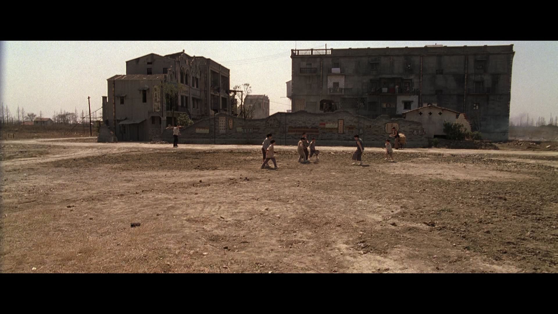
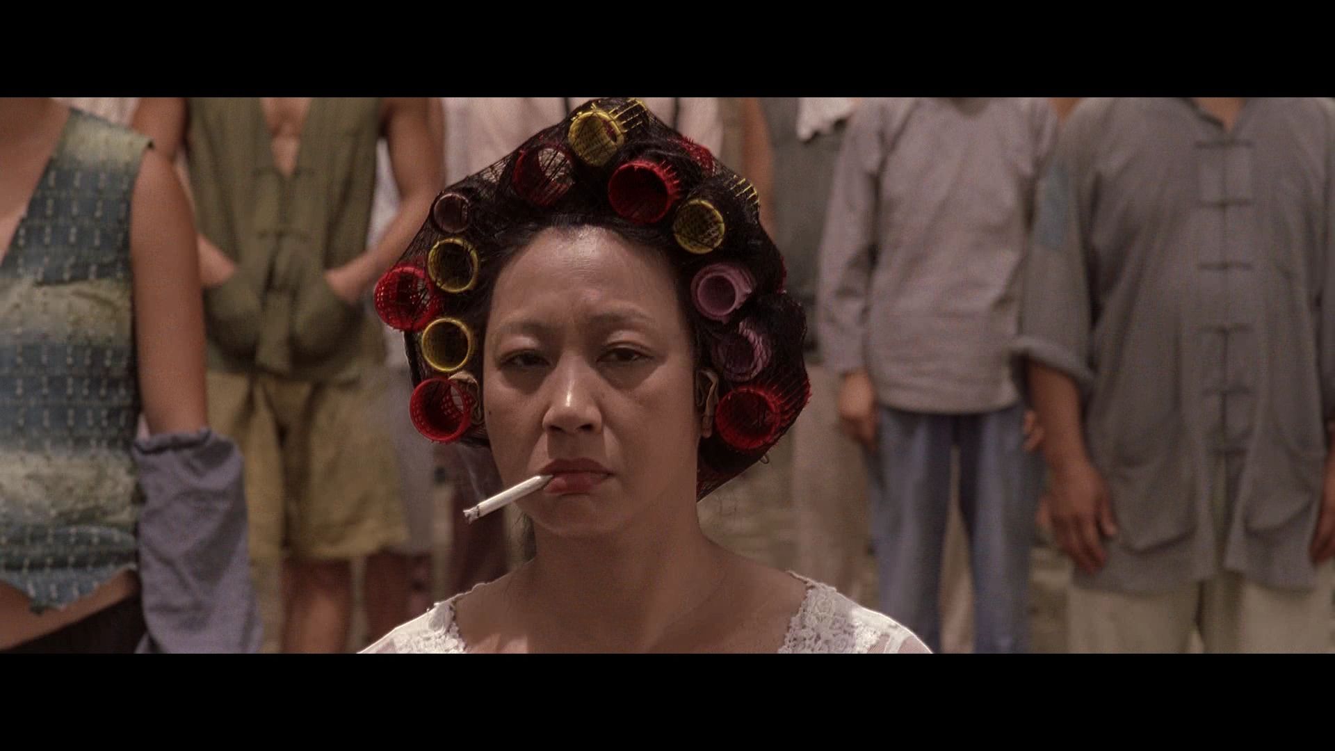
Yup only that second cap I would say is very bad, the others are ok, but all feature some blocking if you look close. Its a pain in the arse really, I expect to be able to pause any film and not see blocking almost everywhere. Its well hidden in some parts of the images, but still all them caps have it all over. Well maybe the title screen is good, I dont think I can spot much on that.
But HD for me should mean no compression blocks riddling an image when you pause.
Posted: 11 Jun 2008, 22:44
by bradavon
romerojpg wrote:as if you do your blind.
We've already been there. I bought the t-shirt
.
romerojpg wrote:It gets a 1 or 2 out of 10 for me, as its shit. Look at the peoples faces. Its ugly as hell.
I've not seen enough HD pictures to really say but 5 out of 10 maybe. 1 out of 10, are you kidding? 1 out of 10 would mean it's the worst looking capture ever, which is bollocks.
tom2681 wrote:Romero is only criticizing one cap. Not the whole transfer.
Really? If so, that is picky to the point of insanity then.
Does it look better than the DVD = Yes? Job done! As far as I'm concerned.
Posted: 12 Jun 2008, 02:59
by Markgway
Romero's spot on. That's second BD cap is atrocious.
Posted: 12 Jun 2008, 03:41
by bradavon
Regardless it's still just 1 frame
.
Posted: 12 Jun 2008, 09:18
by grim_tales
The 2nd cap doesnt look good at all.
Posted: 12 Jun 2008, 09:39
by HungFist
bradavon wrote:Regardless it's still just 1 frame
.
According to that logic it's just every fifth frame

Posted: 12 Jun 2008, 11:37
by tom2681
Note: I always include 5 different types of shots in my comparisons.
A dark cap, a bright one, a wide shot, a close-up and a random frame.
It's likely that all dark scenes look bad in this transfer. It's a low-bitrate Mpeg-2 encode after all.