Page 1 of 2
Fist Of Legend R1 Dimension Vs Dragon Dynasty vs R2FR
Posted: 15 Sep 2008, 14:55
by saltysam
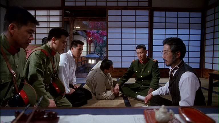
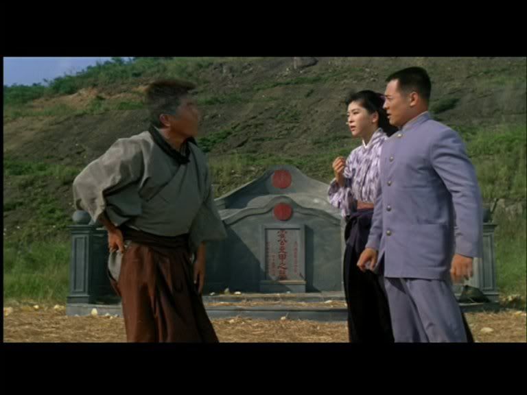
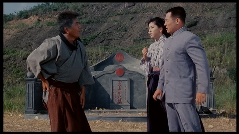
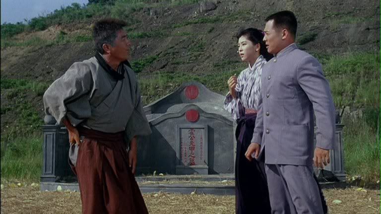
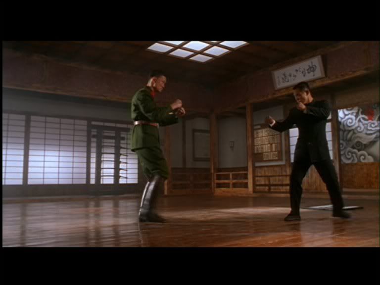
Dimension
HK Vidéo:

DD


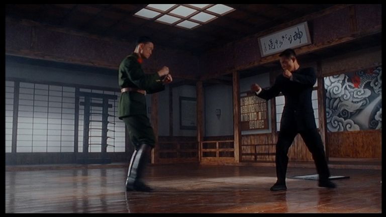
Dimension
HK Vidéo
DD

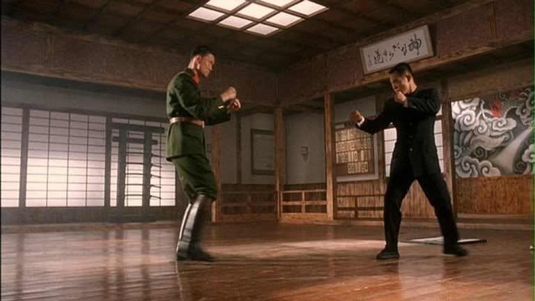
Dimension
HK Vidéo
DD
Dimension
HK Vidéo
DD
Dimension
HK Vidéo
DD
Dimension
HK Vidéo
DD
Posted: 15 Sep 2008, 14:59
by gasteropod
Not a great deal to complain about there, then

Posted: 15 Sep 2008, 15:04
by IronMonkey
Yeah there is, we want this film on BD!
Dragon Dynasty obviously have good enough quality masters, so I reckon they should start releasing the films on both BD & DVD...
Posted: 15 Sep 2008, 16:02
by tom2681
Well, what do you know? For once it's the HK Vidéo that's too dark.
I prefer it to the contrast-boosted DD of course, but a slight increase in brightness would have been nice.
Posted: 15 Sep 2008, 16:07
by Markgway
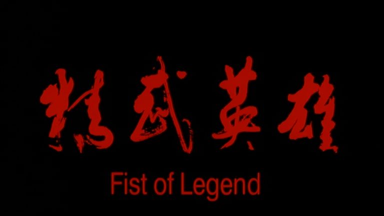
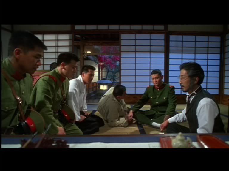
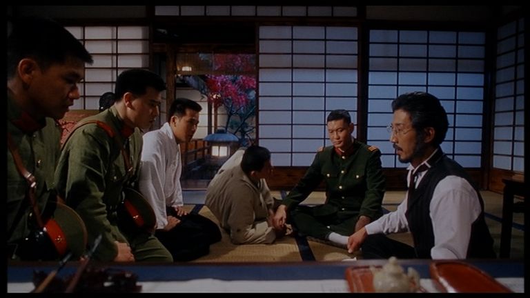
That Dimension/DD title card is a shocker.
Posted: 15 Sep 2008, 16:10
by chenlung
Dimension's colours look the best.
Posted: 15 Sep 2008, 16:37
by grim_tales
DD looks very good apart from the shocking title card, that looks far worse than HKL slapping their "Crime Story" logo onto the original title card for example.
Posted: 15 Sep 2008, 16:44
by tom2681
@Chenlung:
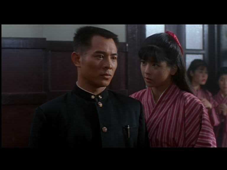
It's not bad, but the contrast-boosting has had some strange effects on skintones.
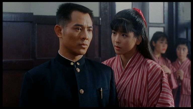
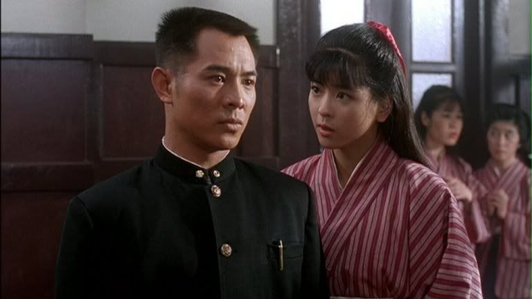
Look at Jet's girlfriend in the second to last cap. She's completely white on the DD.

Posted: 15 Sep 2008, 16:47
by chenlung
tom2681 wrote:@Chenlung:
It's not bad, but the contrast-boosting has had some strange effects on skintones.
Look at Jet's girlfriend in the second to last cap. She's completely white on the DD.
I've been referring to Dimension

.
Posted: 15 Sep 2008, 17:24
by HungFist
tom2681 wrote:
Look at Jet's girlfriend in the second to last cap. She's completely white on the DD.
It's weird. HK Video is supposed to look like that

Posted: 15 Sep 2008, 19:12
by tom2681
@Chenlung:
Sorry, my bad.
I thought you were talking about the DD.
Posted: 16 Sep 2008, 00:32
by Markgway
DD is probably the best by a whisker.
Dimension has richer colours, but is very soft.
Posted: 16 Sep 2008, 00:37
by bradavon
Both the DD and HKV look great. The DD probably wins though.
tom2681 wrote:I prefer it to the contrast-boosted DD of course, but a slight increase in brightness would have been nice.
The HKV looks to have bolstered colours in some shots.
Posted: 16 Sep 2008, 00:56
by Toge
God I hope a BD release comes soon!
Posted: 16 Sep 2008, 03:41
by chenlung
DD is the most 'politically' correct and better because blacks are deeper than HKVideo (it's got subtitles, even though they're not as good as they should be), anamorphic, less-cropped, less-tampering with the gamma levels and not as blue-ish. However, it's still not black enough and contrast-boosted - the last shot looks artificially brightened too.
However, Dimension has the best blacks and colours (levels infact) all-round (even though it's non-anamorphic and soft) and I can't understand why reviewers (Mark Pollard at KFC) dismiss it.
Posted: 16 Sep 2008, 11:19
by Killer Meteor
I thought the Dimension was rather blurry in motion, which isn't something you can always tell from screencaps
Is it true the DD has the frame blurriness that affected Tai Chi Master
Posted: 16 Sep 2008, 23:15
by Markgway
chenlung wrote:However, Dimension has the best blacks
Hmmm......
Posted: 16 Sep 2008, 23:47
by chenlung
Markgway wrote:chenlung wrote:However, Dimension has the best blacks
Hmmm......
Maybe Brad's quote (in your signature) applies to me

. For some reason, I knew I'd be pulled up on that (why didn't you quote the next few words?!).
Posted: 17 Sep 2008, 00:17
by RickyTheDragonSteamboat
Honestly, the DD looked a lot better than I was expecting. But I agree the Miramax version does have better colors though.
Posted: 17 Sep 2008, 00:53
by Shingster
Sometimes I think the members of these forums view these comparison threads with shades or blindfolds on!
The Dimension's colours are clearly over-saturated. The Japanese military did not occupy China looking like The Incredible Hulk! The strongest colours are not always the best! I'd be happy with the colour schemes of all 3 transfers tbh.
The DD transfer really is quite nice, better than I was expecting. It's not nearly as badly contrast boosted as Tom makes out, although the skintones are indeed a little off. It's a touch too bright as well.
Black levels are not stronger on the Dimension, none of the transfers have a problem with their black levels.
Posted: 17 Sep 2008, 11:10
by Killer Meteor
I never understood the praises Gil had for Dimension transfers. They're quite ugly with bad artefacting and edge enhancement
Posted: 17 Sep 2008, 11:14
by chenlung
Ivan Drago wrote:I never understood the praises Gil had for Dimension transfers. They're quite ugly with bad artefacting and edge enhancement
They looked decent to me.
Some of them do have edge enhancement, but they often look better than others doing them.
Posted: 17 Sep 2008, 13:47
by bradavon
chenlung wrote:Maybe Brad's quote (in your signature) applies to me
Huh?
Posted: 17 Sep 2008, 13:48
by chenlung
bradavon wrote:chenlung wrote:Maybe Brad's quote (in your signature) applies to me
Huh?
Was Mark not accusing me of being racist?
Posted: 17 Sep 2008, 16:23
by Markgway
No. I was disagreeing with your assessment that Dimension has better blacks.