The Godfather - http://www.zonadvd.com/modules.php?name ... &artid=843
The Godfather: Part 2 - http://www.zonadvd.com/modules.php?name ... &artid=848
The Godfather: Part 3 - http://www.zonadvd.com/modules.php?name ... &artid=850
The original looks better to me. I don't like how they've messed with the colours. Even before that it doesn't look any sharper etc... They've just made it orange.
Any ideas which has the more accurate colours?
* It's worth noting the original box set was 5 discs: Disc 1: Godfather, Disc 2: The Godfather: Part 2, Disc 3 + 4: The Godfather: Part 3, Disc 5: Extras
* The new 5 disc box set has: Disc 1: Godfather, Disc 2: The Godfather: Part 2, Disc 3: The Godfather: Part 3, Disc 4 + 5: Extras
Because Godfather: Part 2 is now on 1 disc, the picture quality could be sacrificed.
A list of the old and new extras can be seen here:
http://www.dvdactive.com/news/releases/ ... ilogy.html
Not much, in other words!
The Godfather Trilogy: Original (2001) vs. Remastered (2008)
-
bradavon

- Bruce Lee's Fist
- Posts: 24430
- Joined: 27 Oct 2004, 20:30
-
EvaUnit02
- Bruce Lee's Fist
- Posts: 9101
- Joined: 08 Feb 2005, 14:39
- Location: Wellywood, Kiwiland
- Contact:
This new colour correction looks pretty acceptable to me, perhaps closer to how a 3-strip technicolor film should look. Remember that these would've been all remastered in-house at American Zoetrope, so Coppola would've had final say on everything.
But I don't know honestly, Zoetrope's recent remastering of Bram Stoker's Dracula reportedly drained a lot of the warm primary colours that a lot of people loved about that film.
But I don't know honestly, Zoetrope's recent remastering of Bram Stoker's Dracula reportedly drained a lot of the warm primary colours that a lot of people loved about that film.
Last edited by EvaUnit02 on 09 Jun 2008, 10:09, edited 1 time in total.
-
bradavon
- Bruce Lee's Fist
- Posts: 24430
- Joined: 27 Oct 2004, 20:30
You could be right. Some of the Original captures look a "bit" too dark but otherwise they look more natural.EvaUnit02 wrote:This new colour correction looks pretty acceptable to me, perhaps closer to how a 3-strip technicolor film should look.
Except for the colours does anyone see any other changes/improvements?
-
HungFist

- Bruce Lee's Fist
- Posts: 11713
- Joined: 14 Dec 2005, 15:50
- Location: Japan
- Contact:


-
grim_tales

- Bruce Lee's Fist
- Posts: 22073
- Joined: 25 Oct 2004, 18:34
- Location: St. Albans, UK
-
bradavon
- Bruce Lee's Fist
- Posts: 24430
- Joined: 27 Oct 2004, 20:30
I think so. You're the one who started the threadgrim_tales wrote:Wasnt this Harris's photochemical restoration?
https://www.bulletsnbabesdvd.com/forums/ ... php?t=3895
-
grim_tales
- Bruce Lee's Fist
- Posts: 22073
- Joined: 25 Oct 2004, 18:34
- Location: St. Albans, UK
-
captainjoe

- King of Beggars
- Posts: 667
- Joined: 24 Jul 2006, 01:46
- Location: Alberta, Canada
The new transfer is from the original negative scanned at 4K resolution. Robert Harris worked on this transfer and the colour's are corrected to how they looked when the movies first came out.
Wait until we see them for ourselves though, I always find that some websites don't have very good capturing methods.
Plus the old release is plagued by EE and very bad DNR (not visible on caps but definitely on a TV)
Wait until we see them for ourselves though, I always find that some websites don't have very good capturing methods.
Plus the old release is plagued by EE and very bad DNR (not visible on caps but definitely on a TV)

-
bradavon
- Bruce Lee's Fist
- Posts: 24430
- Joined: 27 Oct 2004, 20:30
-
Shingster

- Bruce Lee's Fist
- Posts: 4140
- Joined: 08 Sep 2006, 11:14
Agreed, I've never seen The Godfather in the cinema (before my time) but the colour scheme certanly looks more like technicolor should. Image is sharper, brightness has been significantly improved; much contrast boosting? Sorry Hung, you're wrong there m8. Maybe some clipping of highlights might be going on and I think there might be some contrast boosting, but the blooming that robs detail out of some areas of the grabs probably comes from the increased brightness and colour saturation. Overall there is a much more significant increase in detail in the new transfer.EvaUnit02 wrote:This new colour correction looks pretty acceptable to me, perhaps closer to how a 3-strip technicolor film should look. Remember that these would've been all remastered in-house at American Zoetrope, so Coppola would've had final say on everything.
But I don't know honestly, Zoetrope's recent remastering of Bram Stoker's Dracula reportedly drained a lot of the warm primary colours that people that a lot of people loved about that film.
I'd be happy with the new transfers, but then I won't be buying the Godfather again until I go HD!
-
Shingster
- Bruce Lee's Fist
- Posts: 4140
- Joined: 08 Sep 2006, 11:14
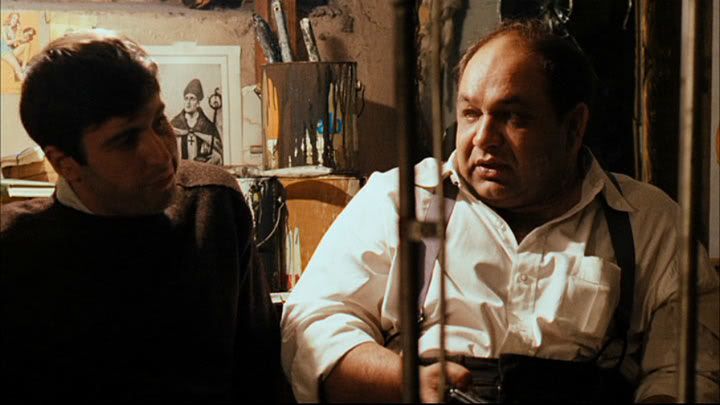
All of them (godfather one i'm talking about here). Most of the grabs the difference is negligable, but if you want the best two examples then look at the 4th comparison down on pg01 (brando talking to someone), and the 1st comparison on pg02 (car parked out in the boondocks).bradavon wrote:Which ones in particular are sharper?
-
HungFist
- Bruce Lee's Fist
- Posts: 11713
- Joined: 14 Dec 2005, 15:50
- Location: Japan
- Contact:
Either ways, obviously something went wrong when detail was decreased.Shingster wrote:Sorry Hung, you're wrong there m8. Maybe some clipping of highlights might be going on and I think there might be some contrast boosting, but the blooming that robs detail out of some areas of the grabs probably comes from the increased brightness and colour saturation.
I don't know what's the intended or original look, and I don't really care here. I'm just not a huge fan of blooming red/orange faces.
-
Shingster
- Bruce Lee's Fist
- Posts: 4140
- Joined: 08 Sep 2006, 11:14
No, nothing went wrong at all! The brightness and colour saturation was just so low in the original transfer that it created extra detail in the boldest areas of the image in exchange for losing a tonne of detail elsewhere in the darker areas of the image.HungFist wrote:Either ways, obviously something went wrong when detail was decreased.
Just because the image does not suit your own personal tastes does not make it wrong! You have to be completely objective when judging transfer comparisons if you're going to make comments like that! It's exactly the kind of comment that brad gets chewed up over all time, sometimes even by you!
-
HungFist
- Bruce Lee's Fist
- Posts: 11713
- Joined: 14 Dec 2005, 15:50
- Location: Japan
- Contact:
Sorry, I didn't know bad remastering could add this much detail (the white shirt)Shingster wrote:No, nothing went wrong at all! The brightness and colour saturation was just so low in the original transfer that it created extra detail in the boldest areas of the image in exchange for losing a tonne of detail elsewhere in the darker areas of the image.HungFist wrote:Either ways, obviously something went wrong when detail was decreased.
Just because the image does not suit your own personal tastes does not make it wrong! You have to be completely objective when judging transfer comparisons if you're going to make comments like that! It's exactly the kind of comment that brad gets chewed up over all time, sometimes even by you!
http://img.photobucket.com/albums/v716/ ... tigua7.jpg
http://img.photobucket.com/albums/v716/ ... izado7.jpg
Anyway, calm down, man. I did't say anything about your girlfriend, I said the new transfer looks shit.
-
bradavon
- Bruce Lee's Fist
- Posts: 24430
- Joined: 27 Oct 2004, 20:30
-
grim_tales
- Bruce Lee's Fist
- Posts: 22073
- Joined: 25 Oct 2004, 18:34
- Location: St. Albans, UK
-
Shingster
- Bruce Lee's Fist
- Posts: 4140
- Joined: 08 Sep 2006, 11:14
No offence Hung, but that's because what you know about the remastering process and assessing DVD/HD transfers, you could write on the back of your little finger. The very fact that you've got Brad acting as your cheerleader in this thread and agreeing with everything you say should be throwing up warning signals for you! Anyway, here are two images:HungFist wrote:Sorry, I didn't know bad remastering could add this much detail (the white shirt)

This is the screenshot from the new release, with the brightness reduced significantly. Note that most of the detail lost in the white bloom is now back in the image. (Not that there ever was much detail lost in the image in the first place! It was one or two creases!)

This is the original release, with the brightness boosted. Note that the bloom on the left arm of the white shirt is almost identical to that in the restored. Ergo: This is not an issue of contrast boosting as you originally claimed. The fact of the matter is that if anything, it is the original transfer that is too dark.
At the very least, you should realise that your comment that the new transfer "looks crap" is an absolutely ridiculous thing to say. Even if you think its image is weaker than the old edition, it's at the very least a competent transfer and it wipes the floor with many of the old exploitation film transfers you're used to sitting through!
If you want me to go into more detail on this, I can. I can also point out just how much more extra detail is in the restored image over the original.
WTF? Someone posts on an internet forum that they think an opinion you expressed is wrong and all of a sudden they're making an angry rant against you? Is your life really that charmed that you can't handle straightforward debate?Anyway, calm down, man. I did't say anything about your girlfriend, I said the new transfer looks shit.
You know what the light source is in that image grim? It's an exposed, standard lightbulb about 4 inches directly above the head of the guy sitting on the left in that image. Do you know how a white shirt will look in a darkened room with a single standard lightbulb shining directly onto it from around a foot away when you film it on camera with mid to high exposure? It blooms. Here's a still from the original release showing how much bloom there is on the wiseguy's right arm compared to the rest of his upper body:The shirt looks too white on the remaster.

-
bradavon
- Bruce Lee's Fist
- Posts: 24430
- Joined: 27 Oct 2004, 20:30
Hey! Your beef is with Hung, keep me out of this.The very fact that you've got Brad acting as your cheerleader in this thread and agreeing with everything you say should be throwing up warning signals for you!
Ask yourself that first, before you ask it of others.Is your life really that charmed that you can't handle straightforward debate?
As far as I'm concerned the original DVDs look better, call me a philistine if you want, you're probably going to anyway. The fact the Remastered DVD may technically be better is secondary to what I prefer. If others disagree, fine, that's up to them.
You're clearly knowledgeable about such things, but that doesn't mean you should come across as thinking you're better than others. Your patronising tone gets dull. As does your persistence to include my name in every other sentence, for no good reason.
-
DangerousLeeHandsome
- Flirting Scholar
- Posts: 313
- Joined: 16 Oct 2006, 03:27
- Location: California, US